How to Combine Woodgrain and Plain Colour Laminates
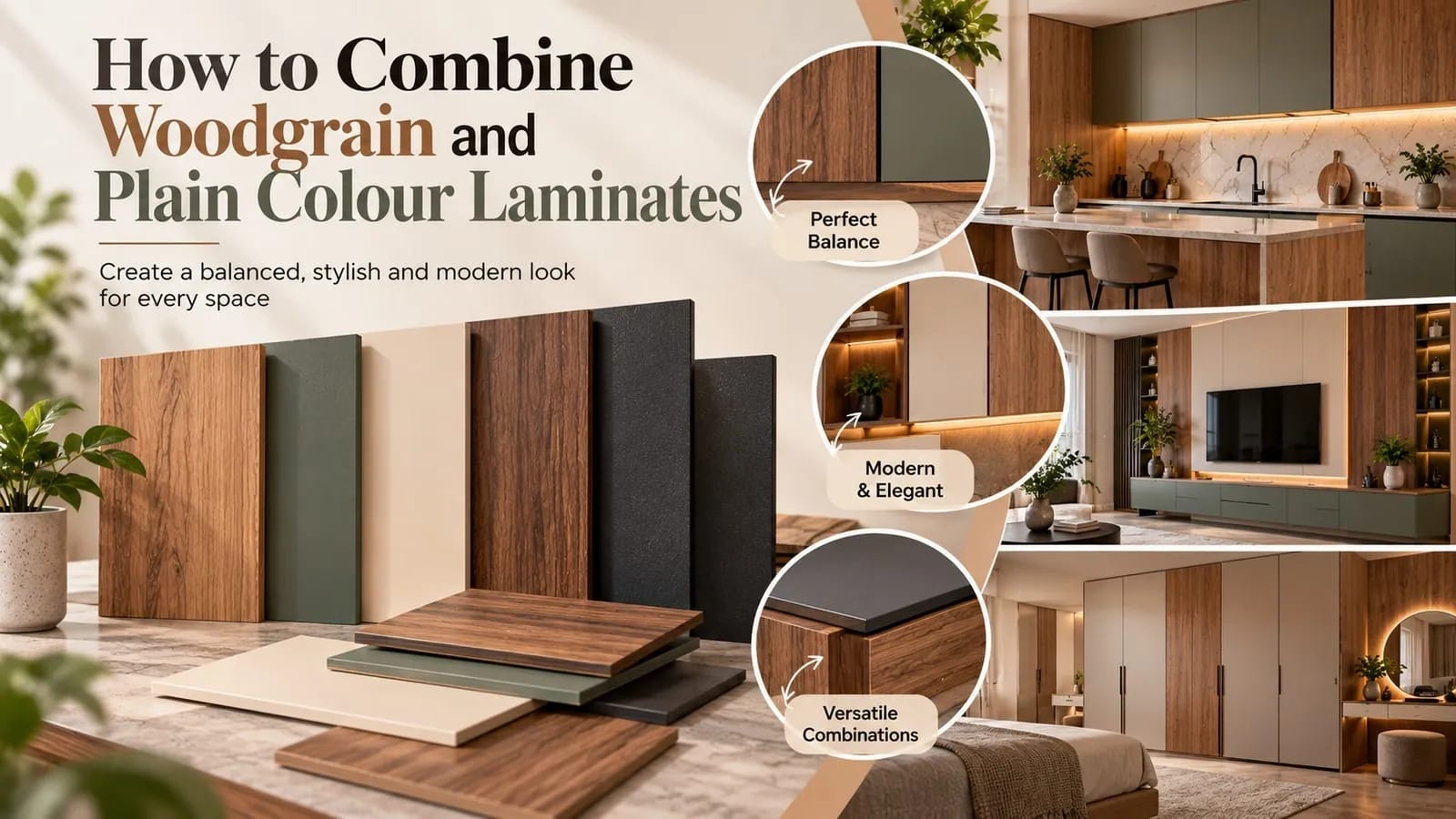
Woodgrain and plain-colour laminates offer two different design possibilities. Woodgrain patterns bring warmth and natural-inspired detail, while plain colours introduce simplicity and visual balance.
When used together thoughtfully, they can create interiors that feel coordinated without looking repetitive.
1. Let One Material Lead the Design
Start by deciding which laminate should be the main visual feature.
If you prefer a warm, wood-led interior, use a woodgrain laminate as the dominant element and introduce a complementary plain colour for contrast.
If you want a cleaner, more contemporary look, use a plain colour as the main surface and bring in woodgrain details to add warmth.
This simple decision gives the combination a clear direction.
2. Pair Woodgrains with Complementary Colours
The colour within the woodgrain can help guide your choice of plain laminate.
- Light woodgrains: Consider warm whites, beige, soft greys or muted neutral shades.
- Medium woodgrains: Explore taupe, earthy neutrals and complementary deeper colours.
- Dark woodgrains: Consider lighter plain colours for contrast or deeper tones for a more cohesive, dramatic palette.
These are starting points rather than fixed rules. The actual undertones of the selected laminates matter more than colour names alone.
3. Use Contrast with Intention
Contrast can make a combination more interesting. A light woodgrain beside a deep plain colour can create a strong visual separation, while similar tones can produce a softer, more continuous appearance.
Think about the effect you want before selecting the final pair. Strong contrast is not always necessary, and subtle combinations can be equally effective.
4. Consider Texture and Finish
Colour is only one part of the combination. Grain patterns, surface textures and finishes also affect how the materials look together.
For example, a pronounced woodgrain paired with a simple plain colour can keep the design balanced. If both materials have strong visual textures, consider whether they compete for attention.
Compare the actual samples rather than relying only on digital images or colour names.
5. Apply the Combination Across Your Interior
Woodgrain and plain-colour laminates can be used together in a variety of applications, including wardrobes, doors, kitchen shutters, TV units and furniture.
For a wardrobe, you might use woodgrain on the main shutters and a plain colour on selected panels. For furniture, a woodgrain body with plain-colour drawer fronts can introduce contrast without overwhelming the design.
The proportions and placement of each material will influence the final result.
6. View the Combination at Full Scale
Before finalising the selection, place the samples beside each other and examine the full sheets whenever possible. Check how the colours and patterns work together under your intended lighting.
A combination that looks balanced in small samples may feel different when used across a larger surface.
Create a Combination That Feels Like Yours
There is no single formula for pairing woodgrain and plain-colour laminates. The most successful combinations reflect the character of the space while keeping the overall design balanced.
Explore woodgrain and plain-colour laminate options at Club Studio and find combinations that bring your design together.